
Design ADA Compliant Wayfinding for Retail Spaces in Holland MI
A practical orientation for retail and multi-tenant owners on what the ADA actually requires for interior room identification signs and how to design wayfinding that helps customers and reduces staff interruptions in Holland, MI.
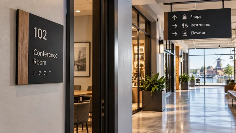
Yes. Permanent room and space identification signs in retail and multi-tenant buildings must have tactile raised characters and Grade 2 Braille, and they must meet the ADA finish, contrast, mounting height and clear floor space rules to be compliant because these elements let people with vision loss independently confirm room identity and navigate retail spaces, and they reduce reliance on staff for basic wayfinding while helping owners meet federal accessibility obligations. The ADA does not require tactile characters and Braille on directional, directory, or temporary signs, though those signs still need legible visual characters and non-glare contrast for accessibility, and owners should still provide high-quality visual design and consider optional tactile or pictogram elements where the customer base benefits.
What does the ADA actually require for permanent room identification?
The ADA requires tactile raised characters and contracted Grade 2 Braille on permanent room and space identification signs, along with non-glare finishes and visual contrast between characters and their background.
These requirements are spelled out in the 2010 ADA Standards for Accessible Design, which set both tactile and Braille rules and the need for high contrast and non-glare finishes for signs that identify rooms and spaces, and include technical tables for character sizes and Braille dimensions 2010 ADA Standards.
Owners, designers and fabricators rely on those technical tables to produce signs with the exact raised and Braille dimensions required so finished signs meet the standard measurements used during plan review and inspections.
Which signs in my retail or multi-tenant building must follow these tactile and Braille rules?
Permanent room and space identification signs that are mounted at or next to doors must follow the tactile and Braille rules, while directional, informational, directory and temporary signs do not have to include raised characters or Braille.
Signs that identify tenant suites, restrooms, offices, mechanical rooms, and other fixed spaces count as permanent room identification when mounted to or adjacent to the room entry, so those signs typically must comply.
This distinction between required permanent identification and optional tactile features for directional or informational signs is explained in the ADA Title III Technical Assistance Manual ADA Title III Manual.
How should tactile signs be mounted and where should they go?
Tactile signs must be mounted so the tactile characters fall within a specified vertical range and so that clear floor space is available for a person to read them, ensuring reachability and an unobstructed approach for people using wheelchairs or who have low or no vision.
- Mount tactile characters with the baseline of the lowest tactile character at a minimum of 48 inches above the finished floor and the baseline of the highest tactile character at a maximum of 60 inches above the finished floor, measured from the tactile character baselines 2010 ADA Standards.
- When a tactile sign is provided at a door, install it on the latch side of the door unless another location is the only readable place, per the mounting and location guidance in the standards 2010 ADA Standards.
- Provide a clear floor space of 18 inches by 18 inches centered on the tactile characters beyond the arc of any door swing between closed and 45 degrees open to allow a person to approach and read the sign 2010 ADA Standards.
Proper placement and consistent mounting also help inspectors and plan reviewers confirm compliance during permit review and final inspection.
What are the rules for tactile characters, Braille and visual letterforms?
Tactile characters must be raised, in uppercase sans serif, and meet minimum height and projection rules, while Braille must be contracted Grade 2 and placed below the corresponding raised text; the standards provide precise dot and spacing dimensions so manufacturers and installers can fabricate compliant signs.
- Raised tactile characters must project at least 1/32 inch above their background 2010 ADA Standards.
- Raised character height measured from baseline must be at least 5/8 inch and no more than 2 inches, with an allowance of 1/2 inch minimum when separate raised and visual characters are provided 2010 ADA Standards.
- Braille must be contracted Grade 2 and positioned directly below the corresponding text or below the entire block of multi-line text, and the standard specifies dot diameters, heights and spacing in Table 703.3.1 2010 ADA Standards.
- Visual character minimum heights and legibility are governed by Table 703.5.5, which ties character size to mounting height and expected viewing distance for readable visual copy 2010 ADA Standards (Table 703.5.5).
- Characters must be uppercase, sans serif for tactile text, and all sign faces must have a non-glare finish with light characters on a dark background or dark characters on a light background to meet contrast requirements 2010 ADA Standards.
These specifications reduce ambiguity for fabricators and increase the chance that tactile features are legible and useful to people who rely on touch to obtain information.
How do I know which directional or directory signs need special treatment?
Directional, informational and directory signs generally do not require tactile characters or Braille, but they must still use legible visual characters, proper contrast and non-glare finishes; consider larger visual character sizes and clear pictograms to assist people with low vision and to speed wayfinding for all visitors.
The ADA Title III Technical Assistance Manual clarifies that directional and informational signs need not have raised characters and Braille, yet these signs must meet character proportion, finish and contrast standards to be accessible ADA Title III Manual.
Consider layering information so directional signs point to general areas while direct room identification signs mounted at doors carry the tactile content required by the ADA.
What design and wayfinding principles should I follow beyond compliance?
Good wayfinding focuses on clear sightlines, consistent terminology, legible typography at expected viewing distances, and logical decision points so customers find their way quickly and staff are interrupted less often.
It also considers lighting, material reflectivity and sign placement to reduce glare and shadow that can interfere with reading, and it balances directory detail so users are not overloaded at a single decision point.
Start by auditing sightlines and natural decision points where a shopper expects direction, such as entrances, major corridor intersections and elevator lobbies, and place clear, consistent signs at those points.
Use consistent naming for rooms, departments and tenant spaces across all materials and maps so a customer sees the same label on the storefront, the directory and the door sign.
Ensure legibility by choosing visual character sizes that match anticipated viewing distance per the ADA visual character guidance in Table 703.5.5, and use high contrast non-glare faces so information reads easily under typical interior lighting 2010 ADA Standards (Table 703.5.5).
Keep directories simple and place them at the building arrival point or at consistent intermediate decision points; avoid overloading a single sign with too many items and consider breaking long tenant lists into grouped maps and stacked directories for readability.
Where practical, run a brief user test or walk-through with staff or regular customers and, if possible, someone with low vision to confirm that sign placement, contrast and copy are effective in the real environment before committing to production.
How does good wayfinding affect staff and customer experience?
Clear wayfinding reduces customer frustration and cuts routine directional questions to staff, which improves service efficiency and the customer experience.
Simple, visible sign systems free employees to focus on service and sales, while customers move through the space with fewer stops, which is especially important during peak shopping periods.
This effect is especially helpful in multi-tenant centers and plazas where frequent tenant turnover or similar storefront names can otherwise increase confusion.
How do local and Michigan codes interact with the ADA?
ADA Standards set the federal accessibility requirements for signs, but local building codes and the authority having jurisdiction can add or interpret requirements, so you should confirm details with your local plan reviewer or building official.
This article is not legal advice and is not a substitute for review by the authority having jurisdiction or legal counsel; local enforcement can affect permitted materials, mounting methods and inspection criteria.
Michigan code officials and local plan reviewers often reference the ADA Standards but may also apply state or municipal rules and interpretations, so early coordination with the authority having jurisdiction reduces surprises during permitting.
How can D-Sign LLC help my Holland, Michigan property meet these requirements and improve wayfinding?
D-Sign LLC in Holland, Michigan produces interior and ADA-compliant signage including wayfinding and directory systems, and we assist property owners with design, fabrication, permitting and installation in Holland and surrounding West Michigan communities.
We can evaluate your existing signs, propose compliant and user-friendly replacements, and handle sign permitting and installation to the authority having jurisdiction.
For owners who need it, we offer a free consultation and design review; our general production window from design approval is two to four weeks when schedules allow.
If you want a practical walkthrough of your building’s signage and a plan that balances compliance and customer experience, contact D-Sign LLC in Holland, Michigan for a site consult and a proposal tailored to your retail or multi-tenant property.
Frequently asked questions
Which interior signs must include Braille to meet ADA requirements?
Permanent room and space identification signs mounted at or next to doors must include contracted Grade 2 Braille; directional, directory and temporary signs do not require Braille.
What is the required mounting height range for tactile characters on ADA signs?
The baseline of the lowest tactile character must be at least 48 inches above the finished floor and the baseline of the highest tactile character must be no more than 60 inches above the finished floor.
Do directional signs need raised characters and Braille?
No, directional and informational signs generally do not need raised characters or Braille, but they must use legible visual characters and meet finish and contrast standards.
How much clear floor space is required in front of a tactile sign at a door?
A clear floor space of 18 inches by 18 inches centered on the tactile characters is required beyond the arc of any door swing between closed and 45 degrees open.
Can D-Sign LLC handle permitting and installation for ADA-compliant wayfinding in Holland, MI?
Yes, D-Sign LLC produces interior and ADA-compliant signage, assists with permitting and installation, and serves Holland, Michigan and the surrounding West Michigan communities.
This article was generated by ArticlesGR.ai by PixelGR.com