
Design Checklist for Multi-Tenant and Directory Signs in Holland MI
A practical, locality-focused checklist for designing multi-tenant and directory signs in Holland, Michigan, covering placement, legibility, accessibility, permitting and updateability.
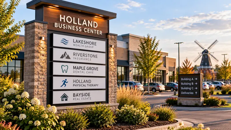
A complete multi-tenant sign checklist covers placement, legibility, tenant panel sizing, hierarchy, illumination, accessibility and permitting so the sign serves tenants and the property over time. D-Sign LLC can help Holland, Michigan property owners and managers plan a system that balances tenant identity with clear property branding and future updates.
What should be on my multi-tenant sign design checklist?
Start with a list that includes site placement, viewing distance, letter height, panel dimensions, hierarchy, logo rules, contrast, material and illumination choices, update strategy and permitting requirements. Use that list to make decisions that apply across monument directories, building-mounted directories and wayfinding signs so the property reads as a coherent system.
How do I balance tenant identity with overall property branding?
Set clear rules that let tenants be visible but keep a consistent property-level frame. Specify a consistent panel shape, margin, typeface family and a limited palette of approved colors so tenant graphics sit inside an unmistakable property template.
Require tenant logos to be scaled within a defined area and to meet minimum contrast standards so smaller tenants are legible. Reserve a consistent header or band for the property name or logo so the asset reads as a single coordinated sign.
Where should the sign be located and how does traffic direction affect placement?
Place monument directories where they are visible to the dominant approach and allow drivers or pedestrians enough sight time to read entries before they must make a decision. For building-mounted directories, locate signs near main pedestrian entrances or elevator banks so wayfinding is immediate.
Map typical traffic flows during planning and verify sign sight lines at the heights drivers and pedestrians use. Consider placing supplemental wayfinding elements downstream from a central directory to break long lists into digestible steps.
How does viewing distance determine letter size?
Choose letter height by estimating the typical legibility distance for your sign and applying accepted legibility ratios. The Federal Highway Administration recommends using a ratio of 1 inch of letter height per 30 feet of legibility distance, which is a reliable starting point for larger outdoor directories and pylon signs; see the guidance in MUTCD Chapter 2A.
How big should tenant panels and letters be for close-up reading?
Use the ADA visual character height rules as a baseline for close-up directory panels. For horizontal viewing distances under 72 inches, the minimum visual character height is 5/8 inch, according to the 2010 ADA Standards for Accessible Design. For longer distances, the standards indicate that for viewing distances of 21 feet and greater you should start with a 3 inch minimum and add 1/8 inch for each foot beyond 21 feet, as detailed in the same 2010 ADA Standards for Accessible Design resource.
Set tenant-panel widths and heights so that each panel can accommodate the required letter height and logo area while maintaining generous margins. A consistent vertical rhythm across stacked panels improves readability and reduces visual clutter.
What hierarchy rules should I set for tenant names and logos?
Answer: Define a strict typographic hierarchy so users find primary entries quickly. Decide which tenants get dominant placement, whether primary tenants have larger panels or type, and how secondary tenants are grouped.
Use numbered or color-coded rows sparingly and only when paired with a clear site map. Reserve color or size exceptions for building anchors and provide a single, predictable rule for any exceptions so the system remains fair and manageable.
Can tenant logos be used on directory panels?
Yes, but control logo use with clear specs. Require high-resolution files, color-contrast checks and maximum logo heights relative to character size. Limit full-color logos to a fixed percentage of the panel to avoid visual noise and provide a grayscale option for highly detailed marks.
How do I design for future tenant changes without replacing the whole sign?
Design modular tenant panels that can be removed and replaced independently. Use routed or inset panel pockets, slide-in inserts, magnetic plates or standardized vinyl overlay areas so individual tenant updates do not require full sign replacement.
Document panel dimensions, material specs and approved vendors in a sign manual so future updates match original materials and finish. For illuminated directories, design internal wiring and LED modules so a panel swap does not require rewiring the entire sign.
Which sign types should I consider: monument, building-mounted or wayfinding?
Choose the sign type based on approach speed, pedestrian volumes and the number of tenants. Monument signs work well at drive-in entrances and parking fields. Building-mounted directories are effective for foot traffic and interior lobbies. Wayfinding signs guide movement across larger campuses or shopping centers.
Use a combination: a monument directory at the main approach, building-mounted directories at entrances, and smaller directional signs at decision points in the site to create a layered wayfinding system.
What illumination and material choices improve readability and longevity?
Answer: Pick illumination and materials that match the site’s character and maintenance capacity. Backlit push-through acrylic panels and internally illuminated metal cabinets work well for visibility in low-light and nighttime conditions, providing even face illumination, better recognition of copy and logos after dark, and improved contrast where site lighting is otherwise limited; choose durable diffusing materials and LED modules sized for even illumination so letters and logos remain legible at night, while non-illuminated routed signs are lower-maintenance, consume no power, resist vandalism and are appropriate for sites that only need daytime legibility or where electrical work is restricted.
Specify finishes that resist fading and choose LEDs for energy efficiency and replaceability. For industrial or medical complexes, choose robust materials and finishes that tolerate cleaning and harsh environments.
What accessibility and readability considerations do I need to follow?
Follow tactile and visual requirements where applicable, and design for good contrast, generous spacing and simple typefaces to aid users with low vision. The ADA standards state that tactile characters should be located between 48 inches minimum and 60 inches maximum above the finish floor when required, as shown in the 2010 ADA Standards for Accessible Design. The standards also specify that visual characters should be at least 40 inches above the finish floor where required, as noted in the 2010 ADA Standards for Accessible Design.
Do not assume a given design meets legal requirements without review. Accessibility rules vary by application and jurisdiction, so treat the ADA guidance as a design reference and confirm compliance with your code official.
What permitting and property requirements should I review before design?
Answer: Before finalizing artwork, request the property or municipality sign packet and confirm setbacks, maximum heights, illumination limits, allowable materials and any tenant panel rules. Many municipalities, homeowner associations and shopping center owners have specific size, color and lighting limits that affect design choices.
Plan for a permitting step in the project schedule and include permitting drawings, engineering and electrical plans as needed. Coordinate with property managers early to document approval pathways for tenant panel updates.
Why work with D-Sign LLC in Holland and West Michigan?
D-Sign LLC works on multi-tenant and directory signage for Holland, Michigan and surrounding West Michigan communities and can handle design, fabrication, permitting, installation and future updates. We build modular systems and provide documentation so properties can update tenant panels without replacing the whole sign, and we consult on accessibility and permitting requirements specific to your site.
We can provide site surveys with sight line photos and basic maintenance plans so owners understand lifecycle considerations and update logistics. We also produce permit-ready drawings, furnish material samples and create a concise sign manual that documents panel dimensions, approved vendors and replacement procedures to help ensure future updates match the original installation.
Contact D-Sign LLC for a free consultation to review your site, assess sight lines and create a sign system that balances tenant identity with property branding and long-term maintainability.
Frequently asked questions
How large should letters be for a directory sign that will be read from a long approach, such as from a road or parking field, where drivers or pedestrians need enough sight time to identify destinations and make a safe decision?
A useful legibility rule is 1 inch of letter height per 30 feet of viewing distance, so apply that proportion and confirm with the site sight lines; see the MUTCD guidance in Chapter 2A.
What are the ADA height limits for tactile characters on signs?
The ADA standards state tactile characters should be located a minimum of 48 inches and a maximum of 60 inches above the finish floor as measured from character baselines.
Can tenant logos appear on directory panels?
Yes, tenant logos can be used if they meet the property's logo size, contrast and file-quality requirements and fit the defined panel area to maintain overall visual consistency.
Will minor tenant changes require replacing the entire sign?
No. Designing modular panels or insert systems allows individual tenant updates without replacing the entire sign.
Do you handle permitting and installation in Holland, Michigan?
Yes. D-Sign LLC provides permitting support, fabrication and installation services in Holland, Michigan and the surrounding West Michigan communities.
This article was generated by ArticlesGR.ai by PixelGR.com
Sources
- 2010 ADA Standards for Accessible Design ada.gov
- Chapter 2A - MUTCD 2009 Edition - FHWA mutcd.fhwa.dot.gov